(01)
THE CHALLENGE
Real Estate Made Easy
Equity, Appreciation, Escrow, Turnkey Approval, what do all these mean? Real estate sounds like complicated business; a field that seems to only open itself up to the elite few who are rich enough to break into the industry. What is the hope for the young and ambitious trying to take steps creating long-lasting wealth early? This was the perception that had been created around the industry for many years, and Zee Realty wanted to break this false perception. They set out with an audacious business model — to create wealth through real estate for the younger generation (Gen-Z's). Our goal was to strategically position them as a brand that could connect with their desired audience and adapt across the dynamic real estate industry.
(DETAILS)
(02)
Out with the Old, in with the New
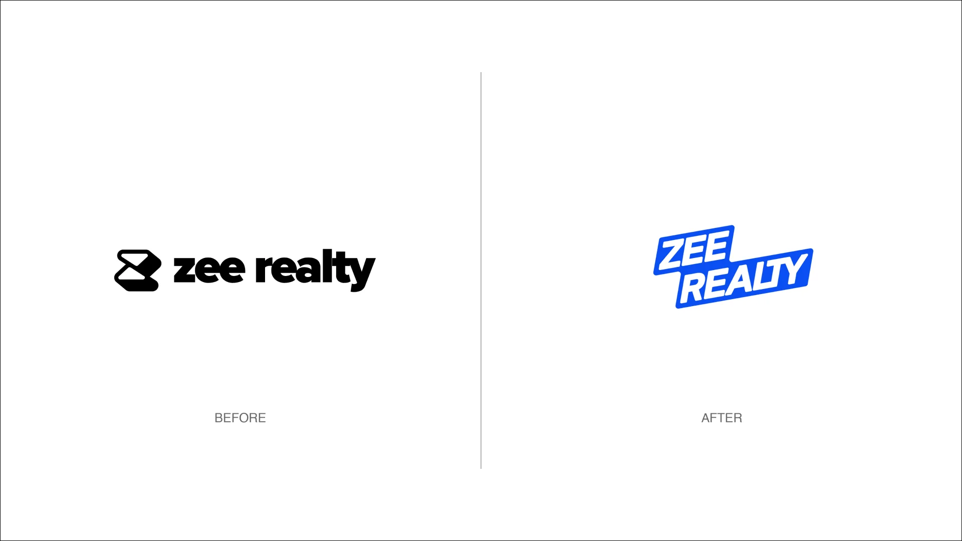
We started our process with a review of the old identity. We realized quickly that not only was the identity not consistent across brand touchpoints, but it did not resonate with their desired audience. After a series of discovery sessions and target user interviews, we realized that Zee Realty was not just trying to build a company, but a tribe — a tribe of financially conscious and financially free Gen-Z's. Based on this insight, we decided to create a ‘tribe identity’ for Zee Realty, positioning them as a life-enabling platform that allowed their members to take control of their financial future.
(WHAT I DID)
Build Positioning Statement
Align Creative Team on Strategy
Design Stylescapes
(03)
Tribe Identity: The Zee Flag
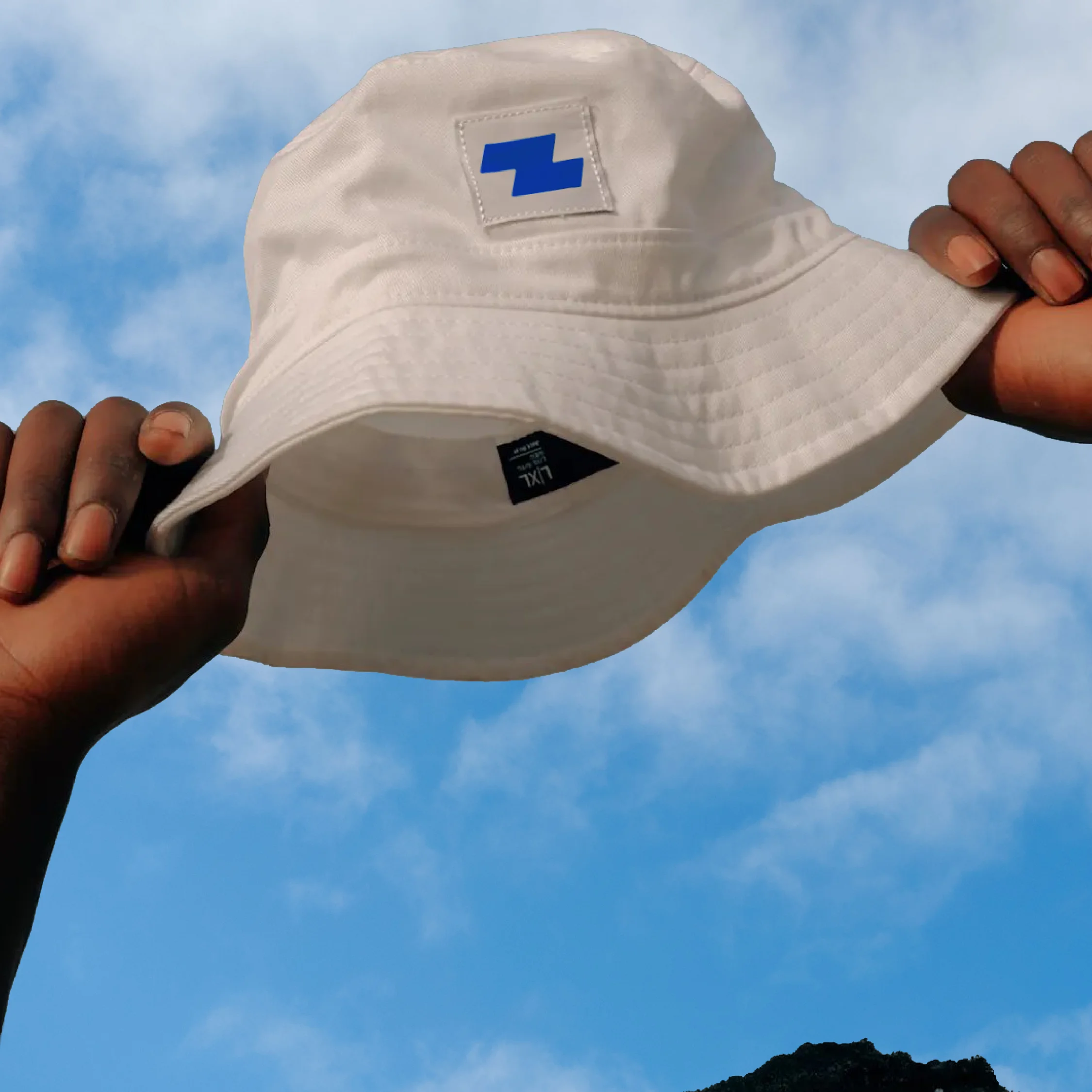
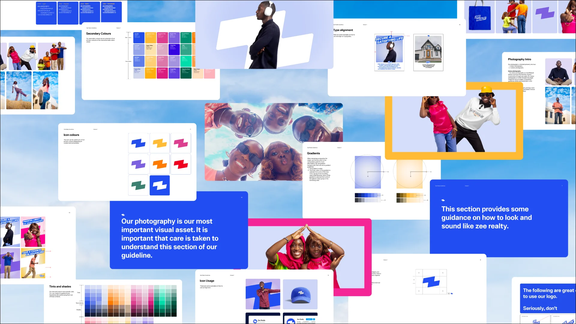
What better way to represent the idea of a ‘tribe identity’ than with its own flag. A flag: a representation of liberty, a mark of ownership, destination and trust. A celebration of growth, milestones reached, new land/property acquired. The Zee flag is the cornerstone of the new brand identity. This is supported by approachable typography, custom illustrations and animations, photography, a bright color palette, and marketing language that emphasizes the joys of community and financial liberty.
(WHAT I DID)
Logo System
Color / Typography
Layout
Brand Guidelines
(04)
Demystifying Real Estate
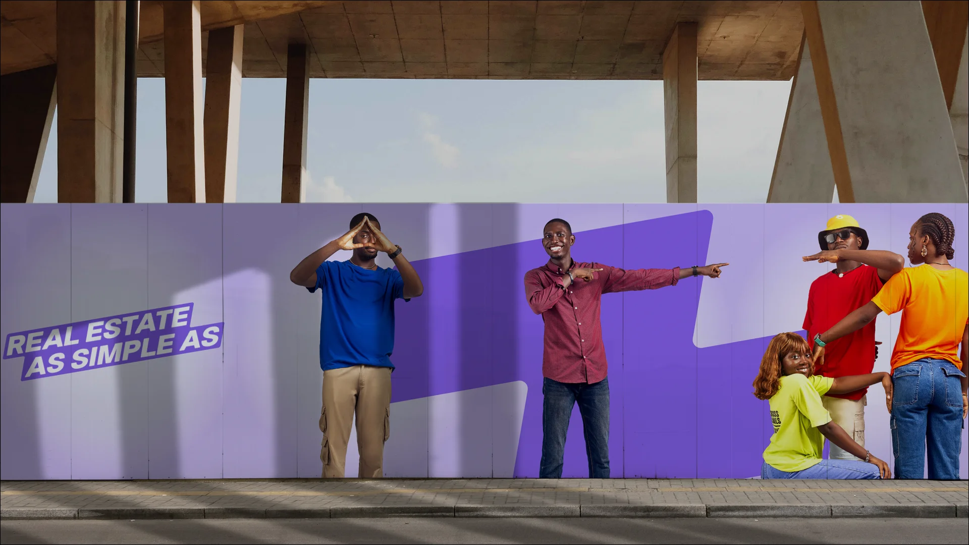
Real estate can sound like complicated business, but the way we talk about it doesn't need to be. We wanted to make our communication as simple as possible; to do that, we created a verbal identity that was crystal clear, straight to the point and super easy to understand.
(WHAT I DID)
Messaging
(05)
Bringing It All Together
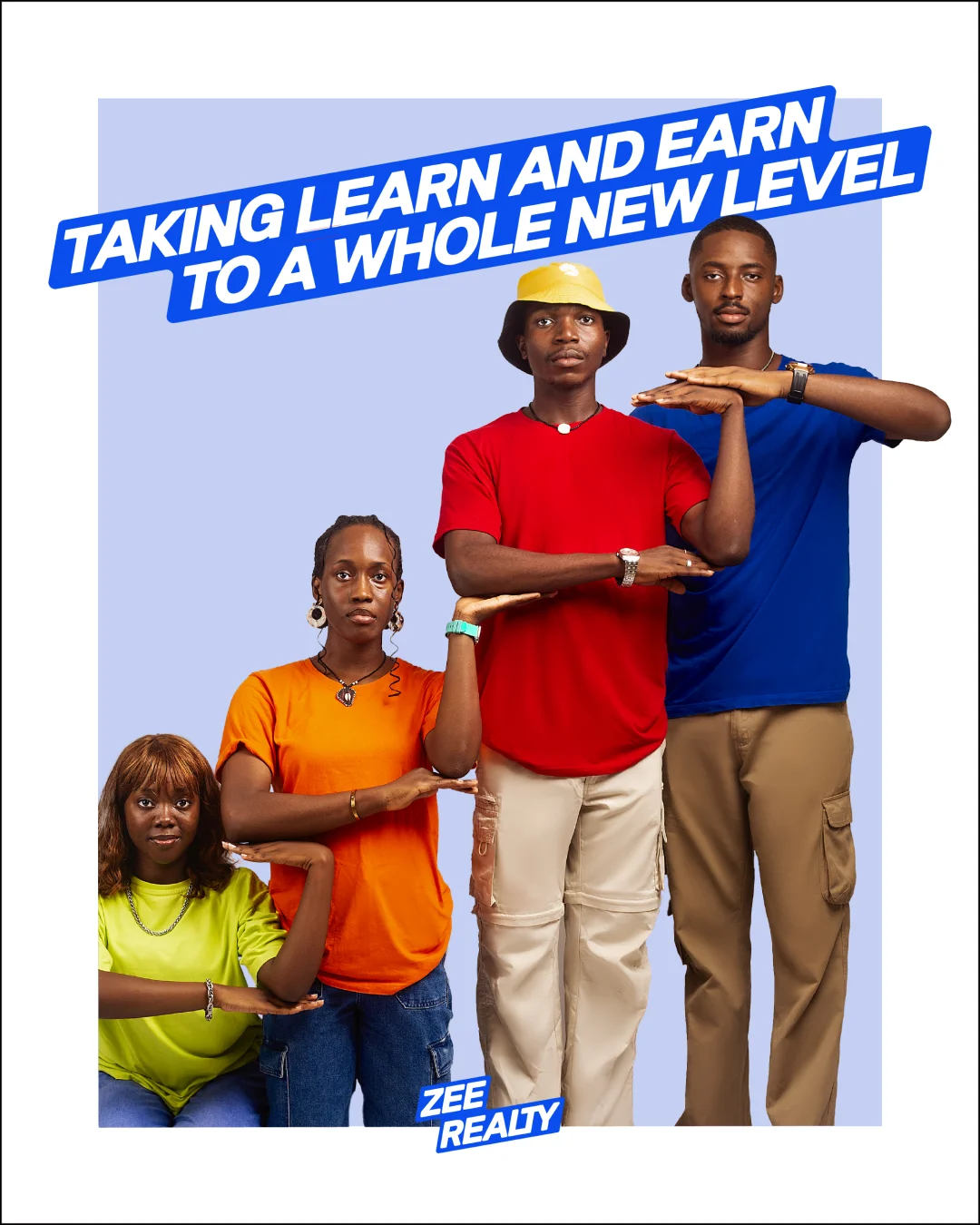
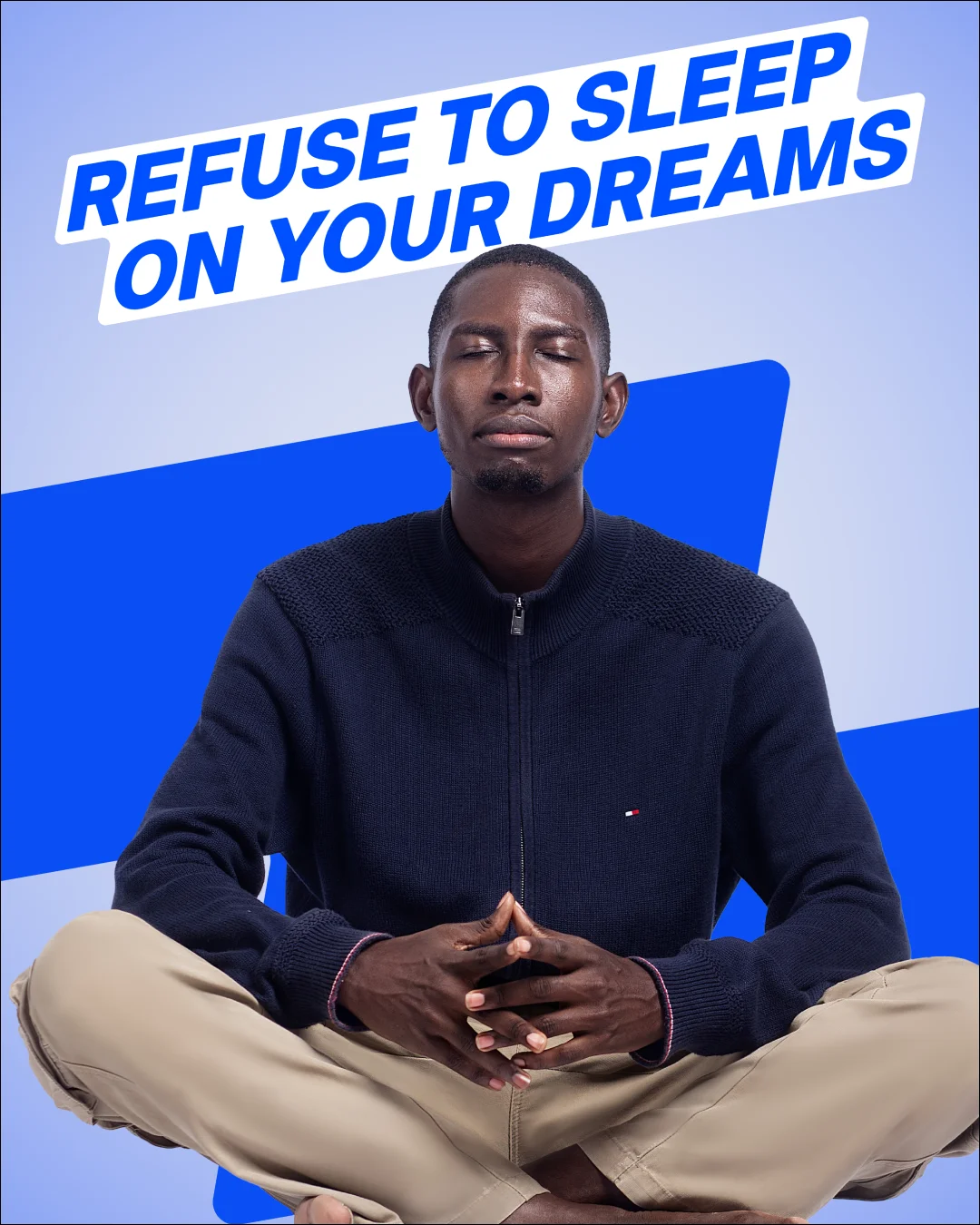
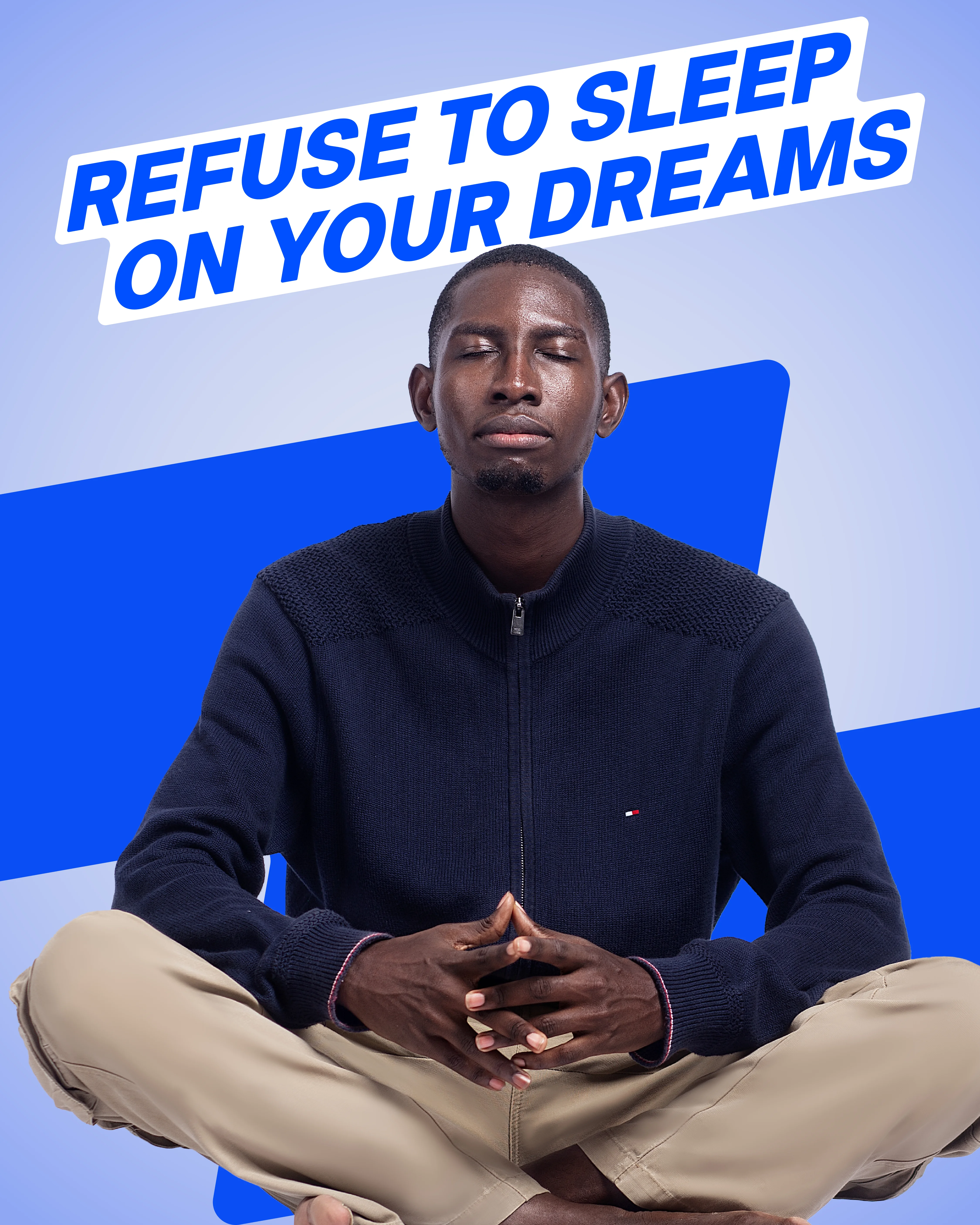
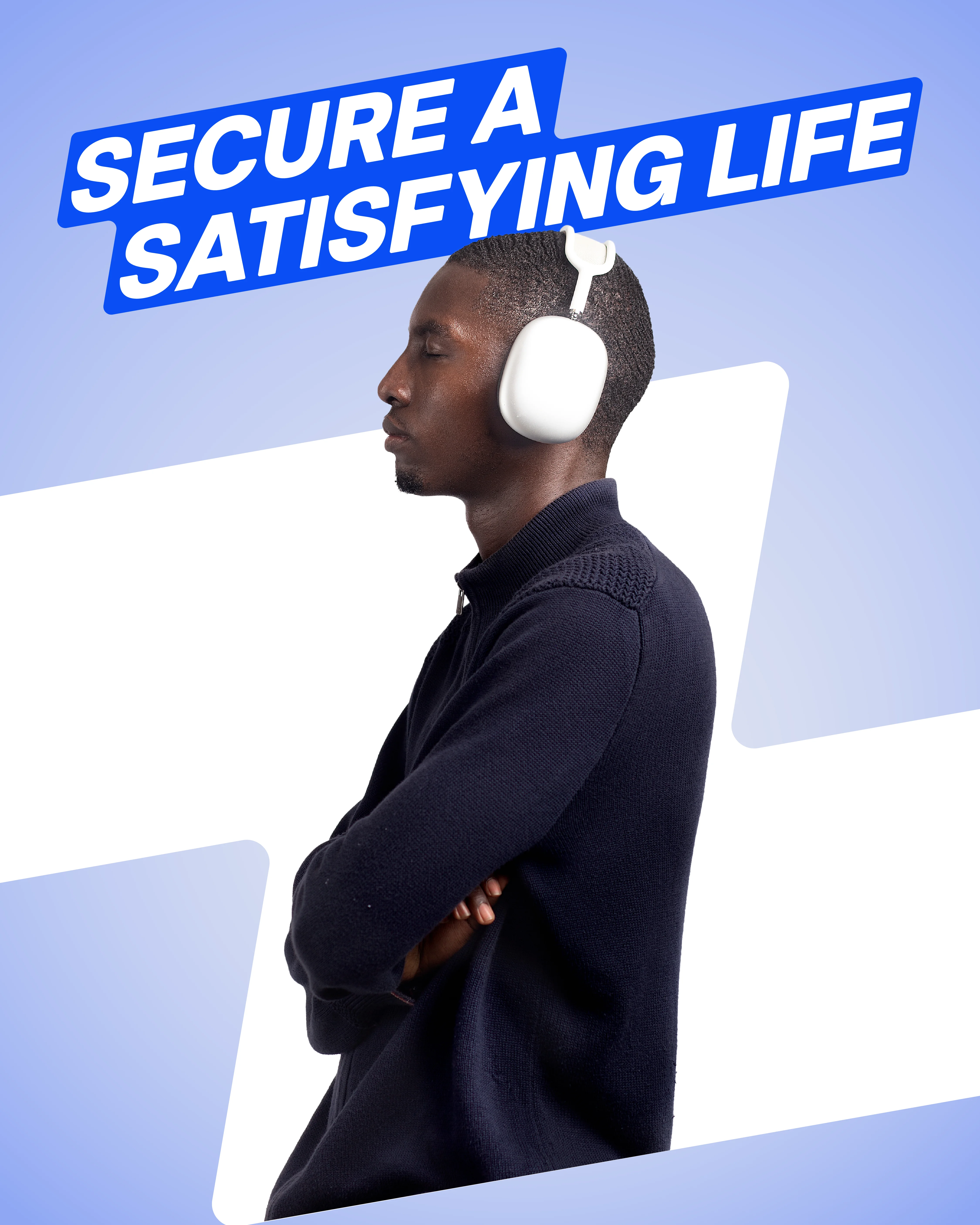
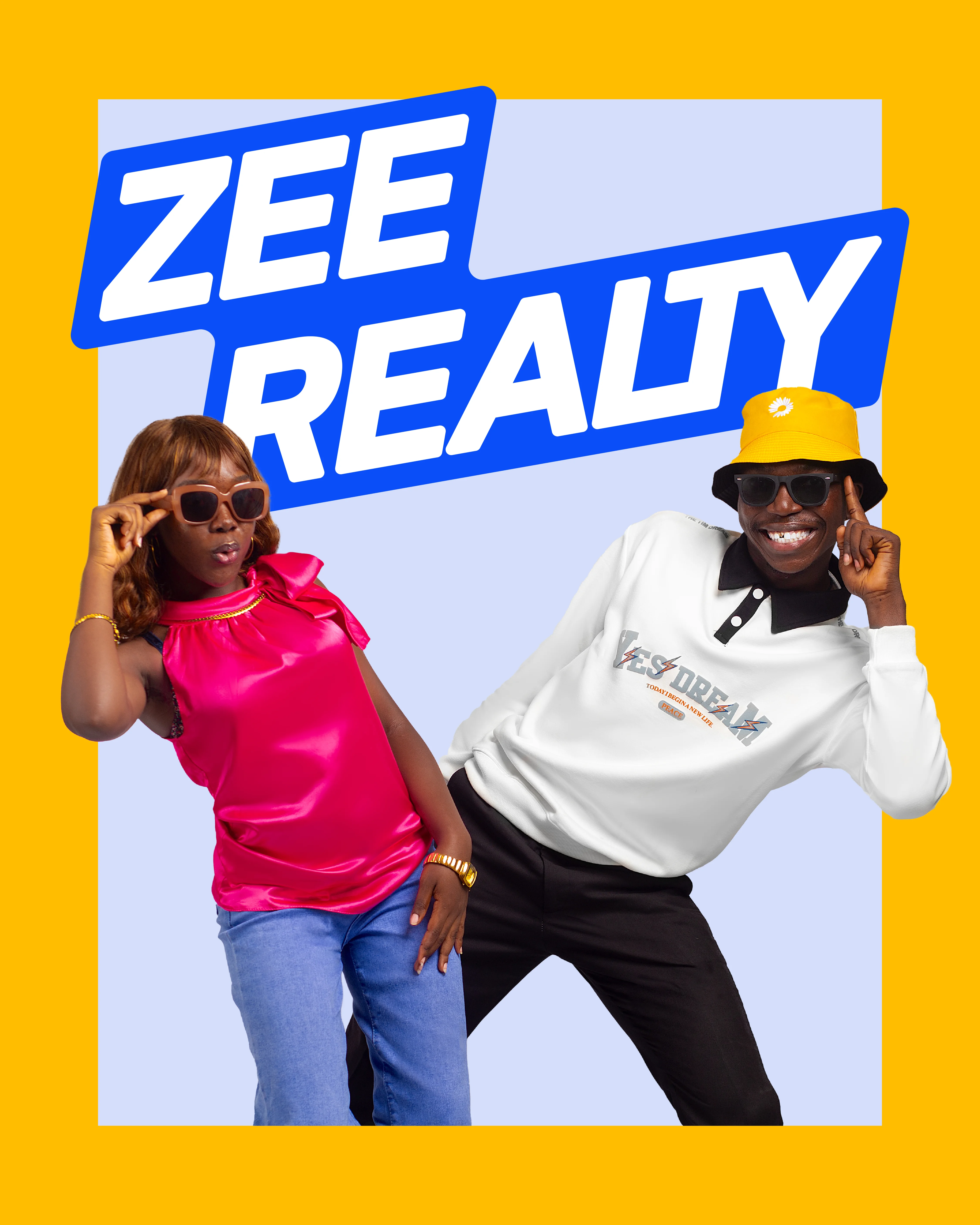
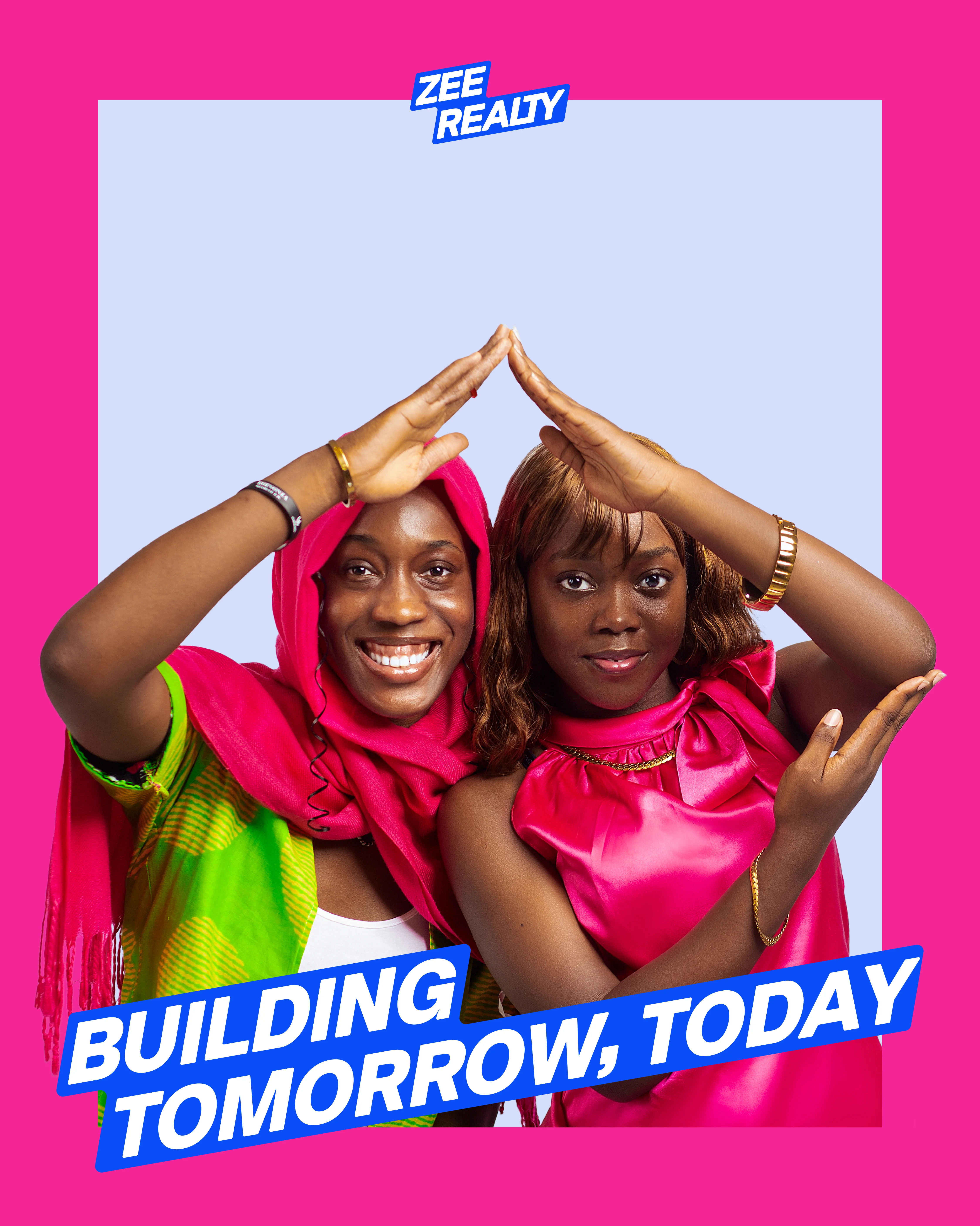
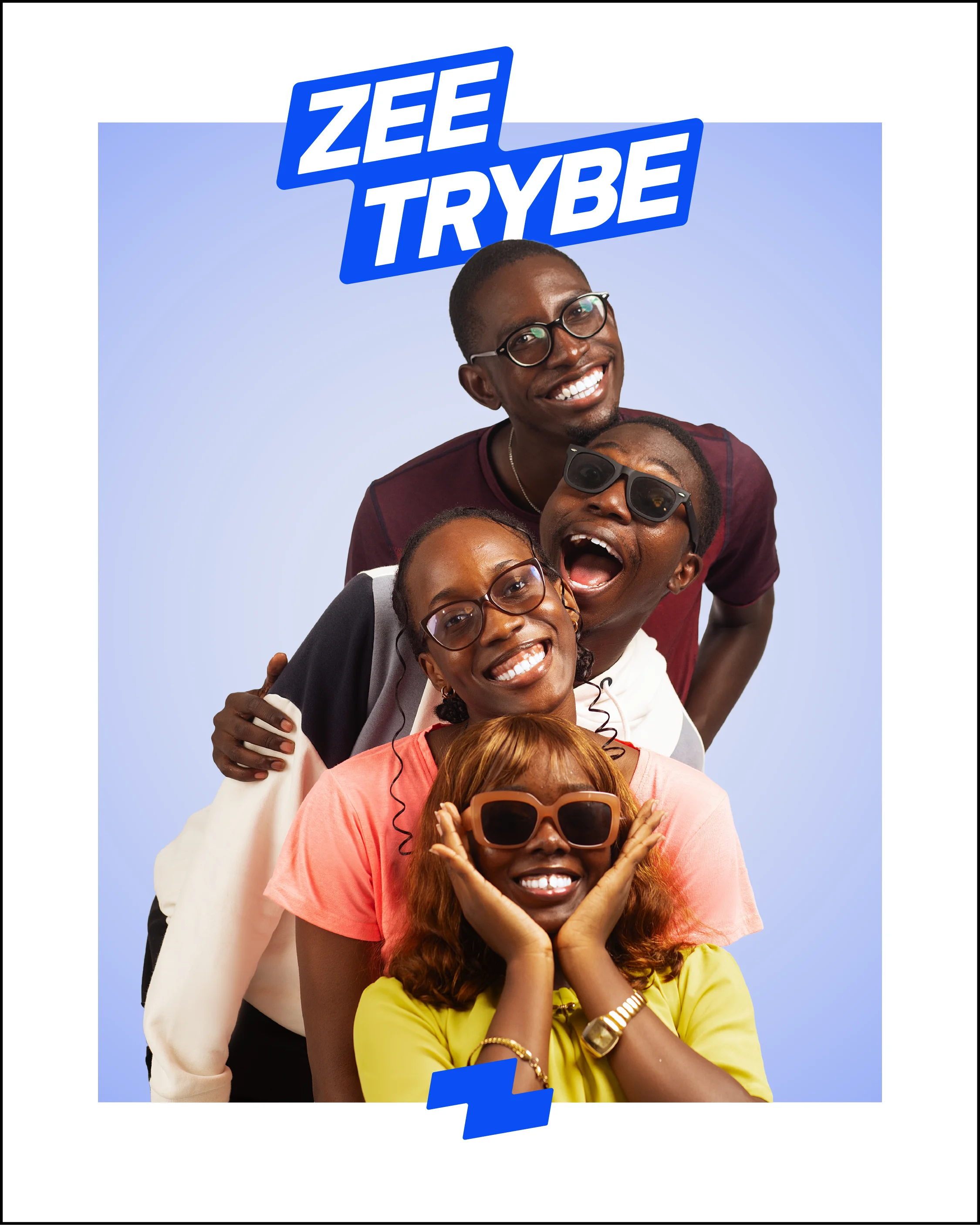
Brand photography was one of the most crucial areas of our brand identity. We wanted to center Zee Realty not around its services, but around the audience it served. Based on this goal, we organised a photoshoot for the brand that was entirely ‘people-centric’. Each pose was pre-planned based on our messaging, and was intentionally directed to portray certain actions and emotions. With this as a foundation, we built marketing posters to prepare the brand for launch. The composition was:
Messaging + Photography + Color
(WHAT I DID)
Photography Direction
Poster Composition
Model Recruitment & Modeling


MORE CASESTUDIES